

Project year: 2014/15
The problem
Virgin's digital publishing platform and corporate hub Virgin.com was positioned in an increasingly crowded landscape. Audiences were being eroded by competitors and the rise of new social content platforms. Our analysis showed a gap in the market for high quality, immersive content aimed at entrepreneurially minded 18-34 year olds. The objective was to devise a strategy to target this audience and reimagine Virgin.com to grow our audience, build the brand and create new customers for the Virgin group now and in the future.
The client
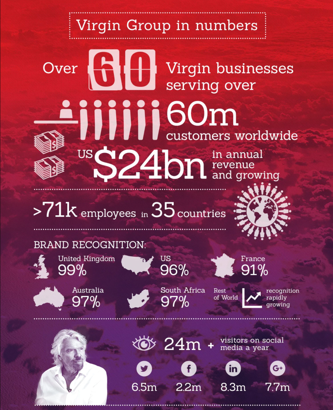
The Virgin Group oversees all Virgin companies (VCos) and supports their growth and prosperity. It is also responsible for the Virgin brand and leads Virgin's charitable/ non-profit endeavours such as Virgin Unite (Virgin's charitable foundation). Virgin.com directly and indirectly generates revenue for VCos and through lead generation and advertising.
My role
I led the redesign of Virgin.com. Working with a product manager, front-end and back-end developers and our client team of editors, writers, performance analysts and commercial directors. I championed a Human Centred Design process and gained buy in to a discovery phase and process of iterative design and delivery.
Our objectives & success measures
Objectives:
- Drive a positive shift in Virgin brand sentiment.
- Drive an increase in group value and sales through VCos.
- Inspire the next generation of entrepreneurs to create businesses with strong social purpose.
- Create content that helps Virgin and the Branson family make a positive difference.
- Generate complementary revenue streams which enable the platform to breakeven.
- Increase engagement (through multiple metrics e.g. traffic, dwell time, bounce rate, pages/visit).
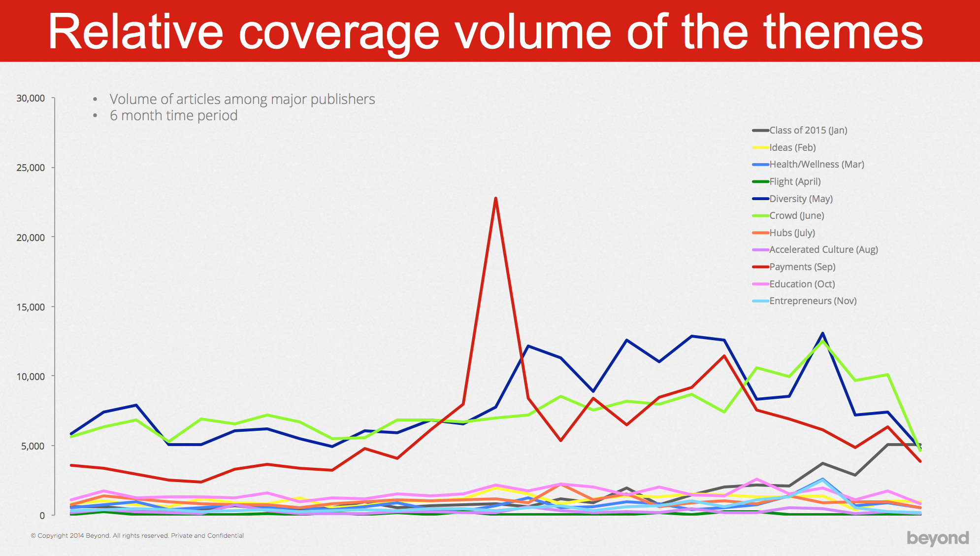
Discovery: analysing the landscape, content performance and user behaviour
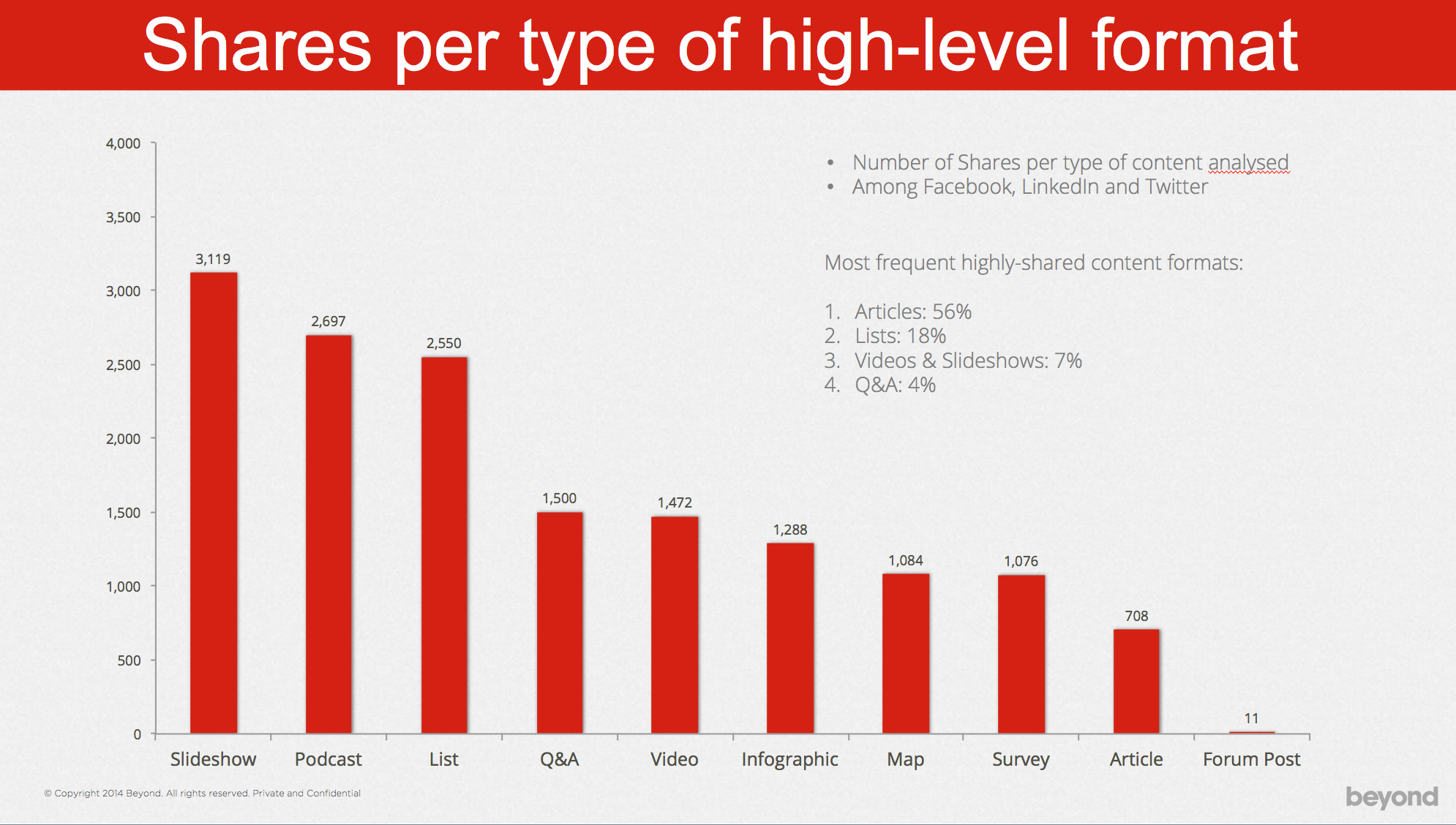
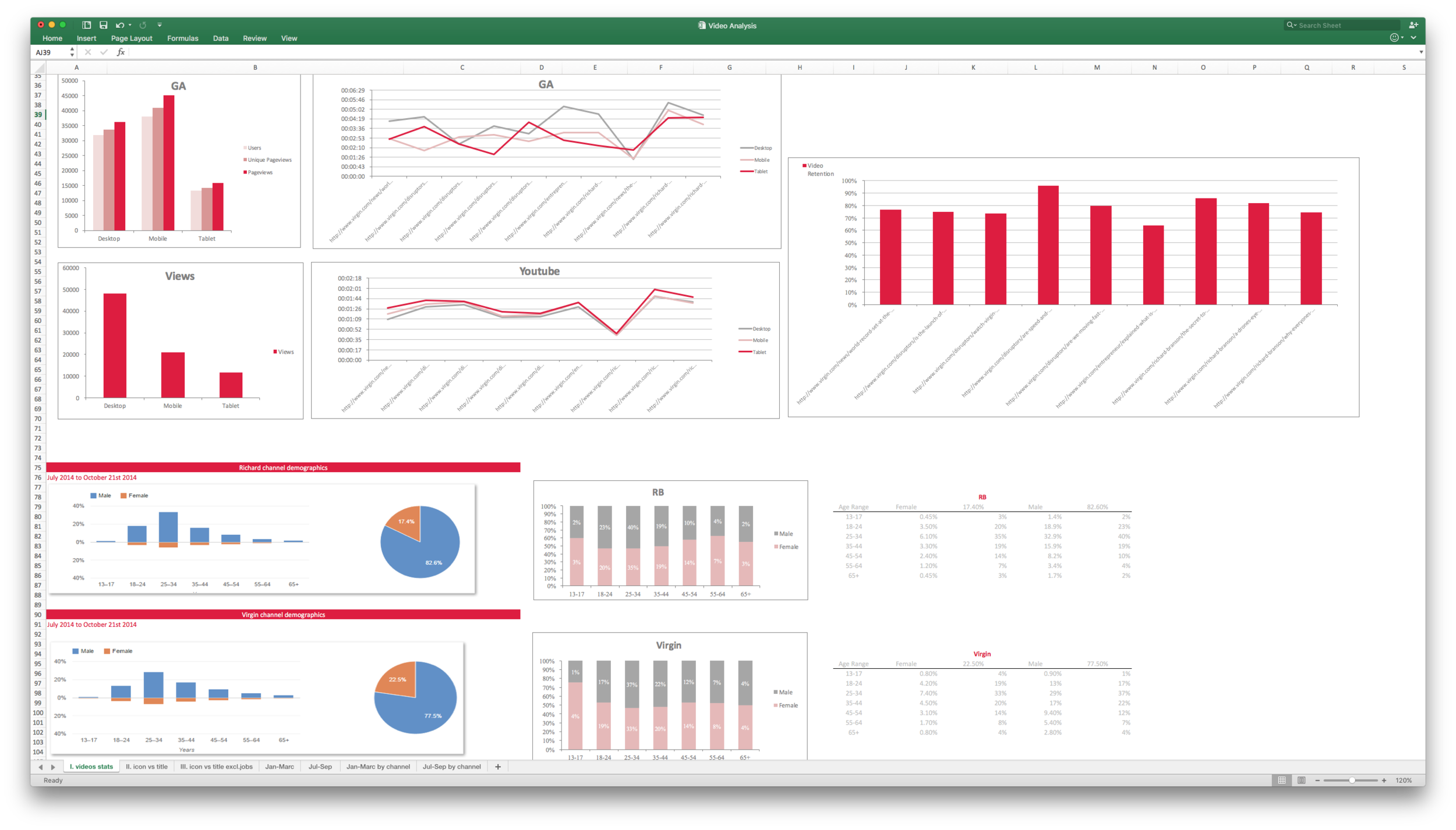
To gain an understanding of the current state and user attitudes and behaviours, I analysed a vast amount of data. Analysing the digital publishing landscape & Virgin competitors, reviewing platform analytics & performance data from content previously published on Virgin.com and exploring user behaviours across all Virgin content channels (e.g. Twitter and YouTube). This allowed me to get a sense of what was working currently, what could be improved. I generated insights that would inform our strategy.
I spent a lot of time analysing behaviour in Google Analytics to understand user behaviour on and off the site - modelling user journeys that were proven to be statistically important. I put together a presentation of findings to share with the team.
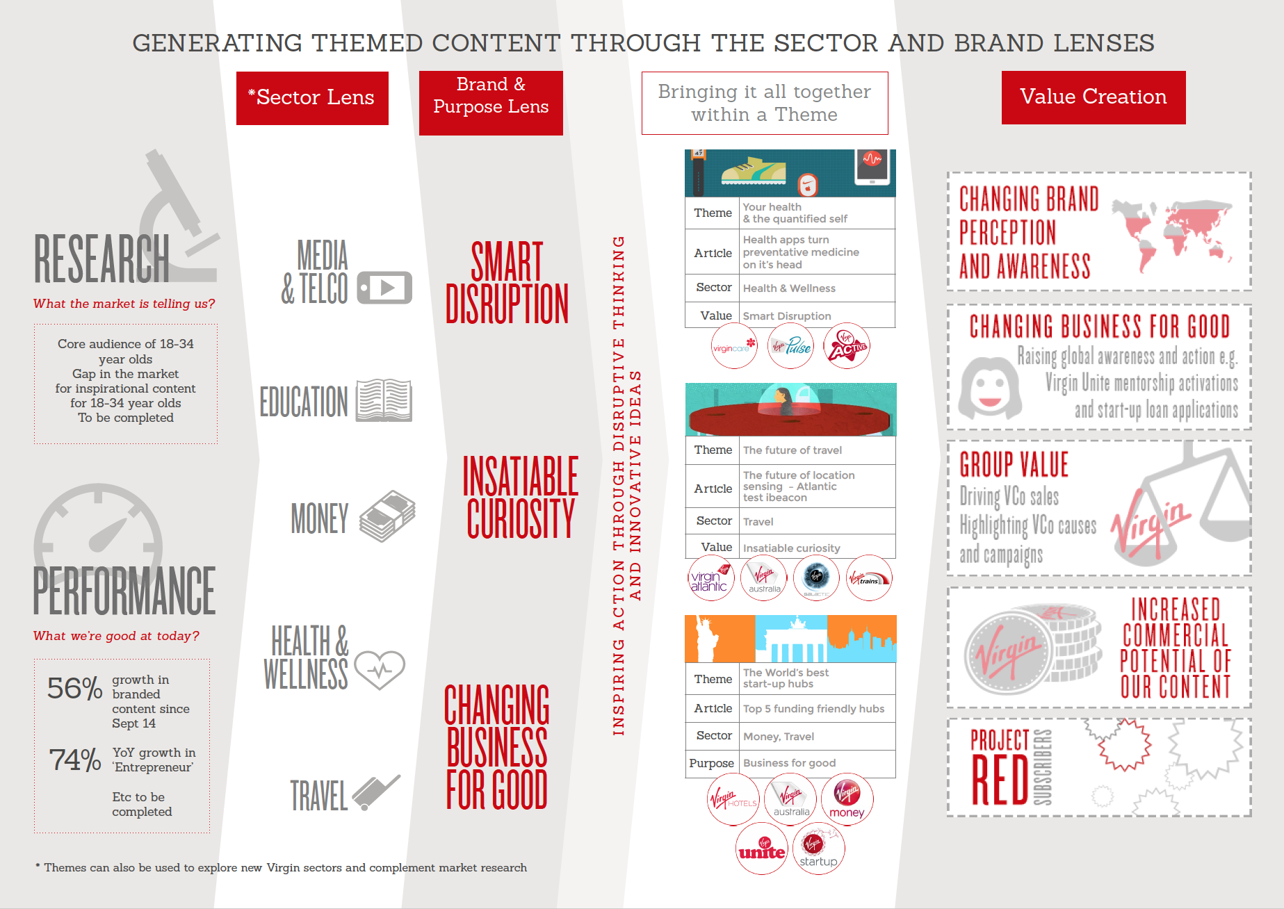
Creating a value driving, on-brand content strategy
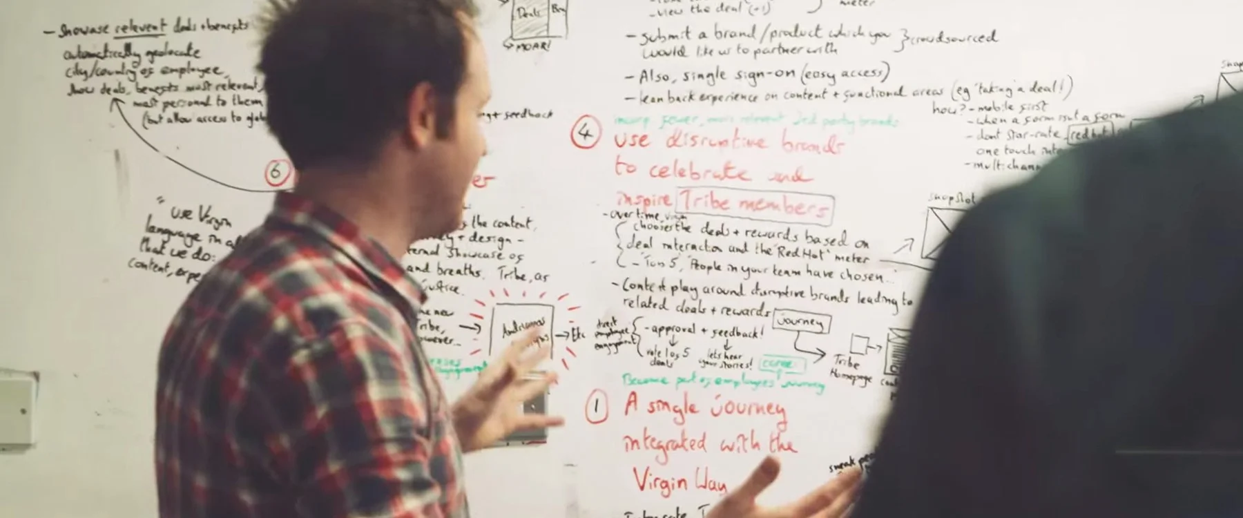
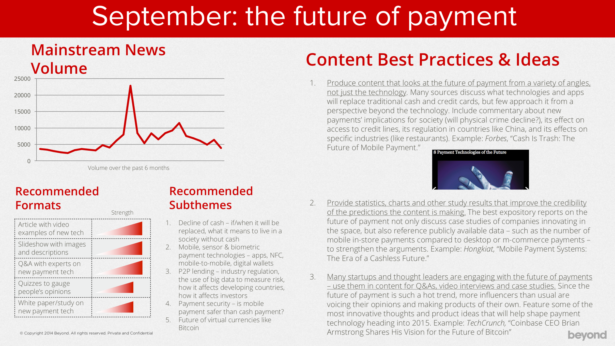
I worked collaboratively with Virgin's editorial and brand teams to devise a content strategy that would appeal to our new target audience of entrepreneurial minded 18-34 year olds while capitalising on existing behaviours. During an all day workshop we explored and analysed more data and eventually came up with a framework that would lead to the content strategy illustrated below.
The diagram shows how the elements below combine to create content themes that ultimately drive value for VCos and the Virgin Group:
- Sector Lens - the sectors in which VCos operate.
- Brand & Purpose Lens - the Virgin brand and its purpose.
Content themes were then sequenced into a calendar. A different theme would be "In Focus" each month.
Customer journey modelling
Our research had shown that our users were a diverse group. Ranging from entrepreneurs to the public (with an interest in entrepreneurship/ tech) and those with a relationship or need related to the Virgin brand (e.g. someone looking for a VCo, investors or job seekers).
We also learnt that the majority of users (especially entrepreneurs & the public) were broadly visiting the site to consume content... However we did not uncover a correlation between user type and content topic/ format.
I created the diagram below to illustrate the behaviour on the site. The idea is that broadly speaking users (shown at the top) will progress through the content types and trigger actions (that align with our site KPIs) at the bottom.

Prioritising requirements
I ran a workshop with all our stakeholders to review our learnings and discuss the merit of potential requirements. With stakeholders from editorial, performance, brand and commercial, we were able to discuss requirements in depth and weigh up the pros and cons of each. I showed some rough sketches of early feature ideas to give the team a sense of how requirements could be met. We wrote requirements down on post-it notes and discussed different ways of meeting each requirement. Eventually we reached a prioritised list. Our top ranking requirements were:
- Support content created around monthly content themes with a new theme each month.
- Support an increased focus on video content.
- Support an increased variety of content formats (e.g. quizes, infographics, lists).
- Improve the search experience, supporting filtering by tags/ themes/ formats.
- Support a live feed of news from events.
- Leverage traffic driving opportunities when Richard Branson attends events.
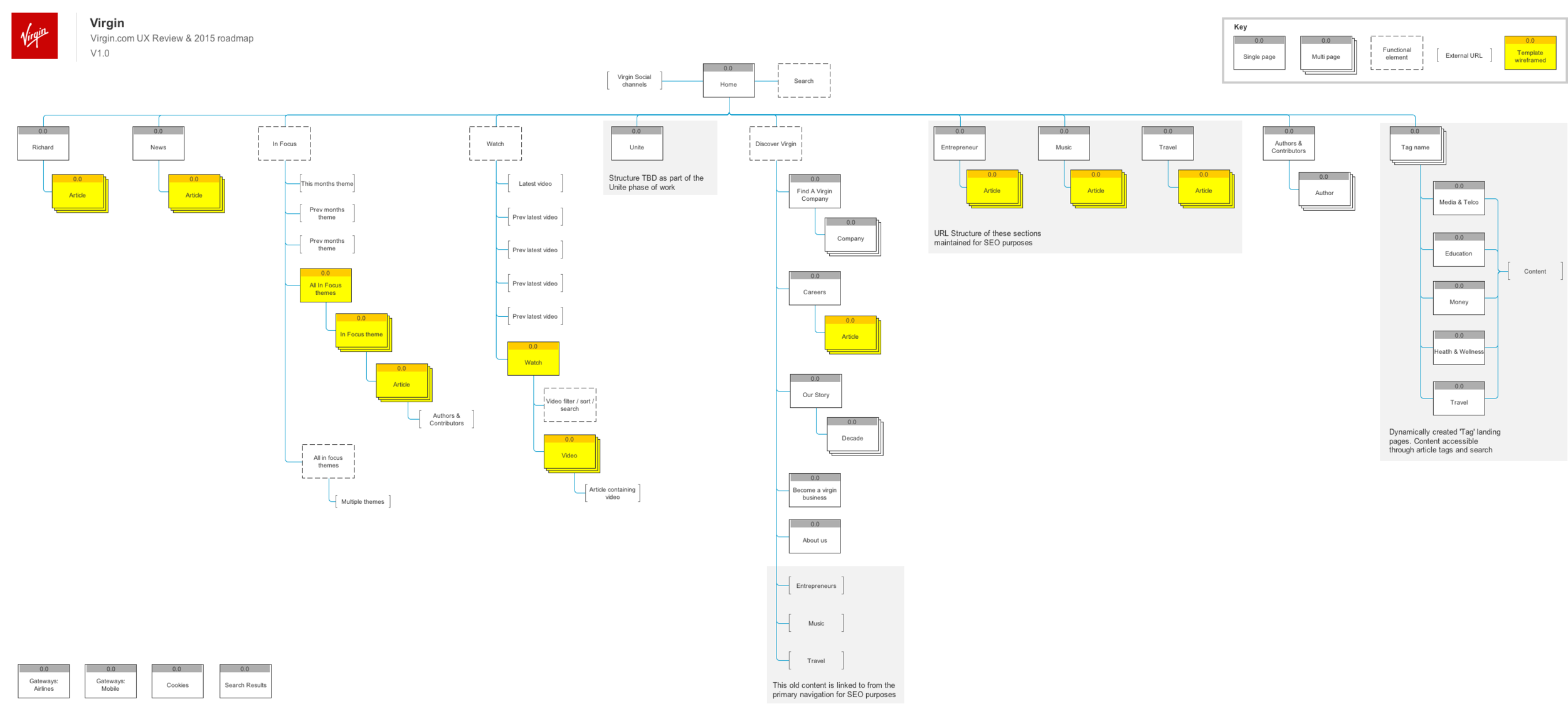
An updated information architecture to support new features without impacting site performance
The challenge was to design a revised information architecture for the site that would support the new strategy & the addition of new features while maintaining existing URL structures and global navigation links to key content pages. This would ensure we maintained as much organic search "equity" from pages receiving a large amount of inbound organic traffic. With over 2.3m unique page views per month this was crucial to the success of the redesign.
Working with our SEO specialist, I iterated on the architecture and navigation design to ensure it would have minimum impact and be optimised to drive more traffic to new themed content pages. I ran card sorting exercises with users to gain an understanding of their mental models of this content/ information, and later validated the architecture in the same way I tested navigation prototypes with users to get feedback.
New areas of the site are shown in grey boxes. Pages that I created wireframes for are highlighted in yellow. We would design and build a total of 4 templates.
Designing & prototyping
I used Axure (my tool of choice in 2014) to create high level user stories, collect insights and notes, create sitemaps, create an index of pages/ templates and create my wireframes & prototypes. I shared iterations with stakeholders by publishing the project online. You can view an iteration of the project here.
Key features
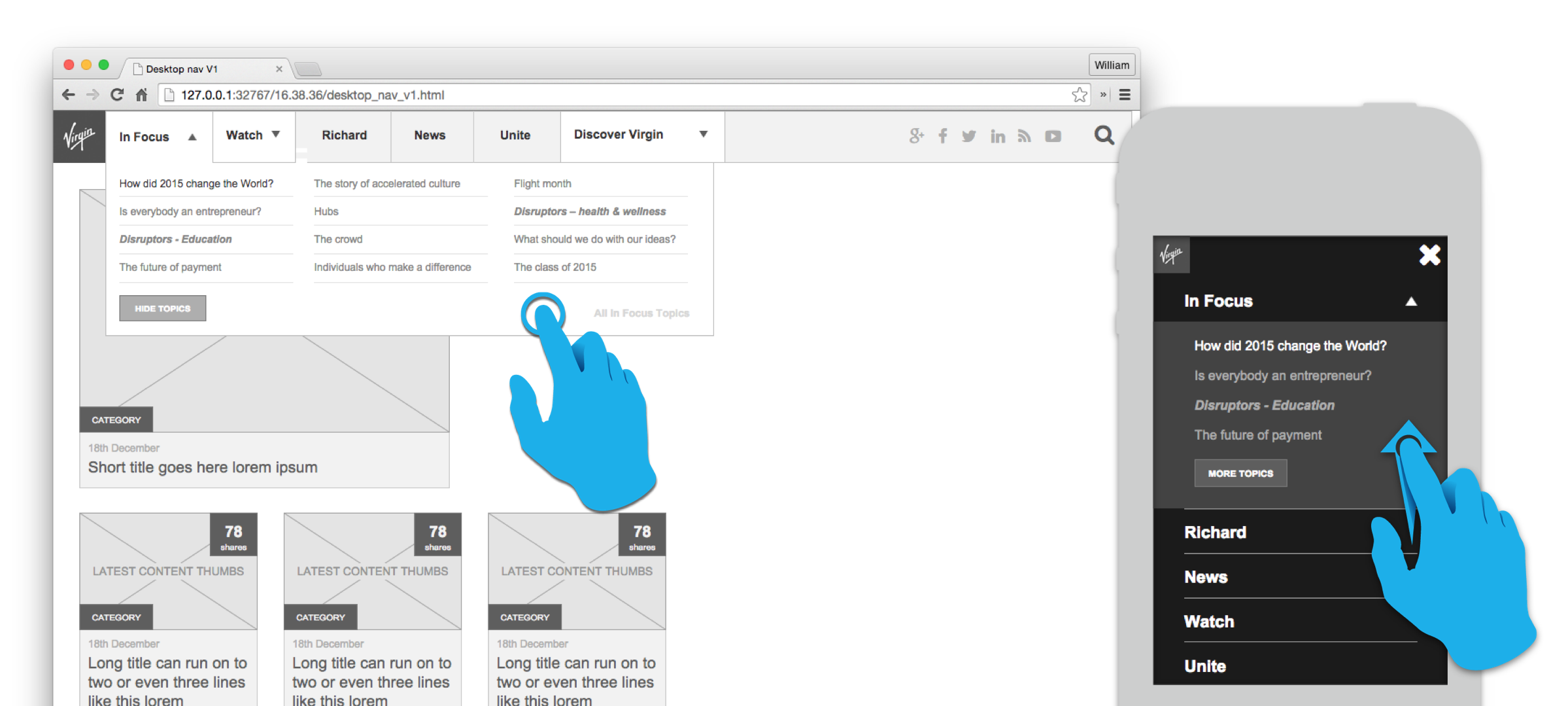
Updated global nav supporting focus on themes & video
I designed an updated global navigation that would allow users to easily discover content using the monthly 'InFocus' content themes. The navigation also featured a 'Watch' section that showcased the latest videos published on the site.
In situ recommended article link
We launched a recommended article list shown after the first paragraph/ paragraphs. This used the content recommendation engine to suggest another article based on the users behaviour on the site and the behaviour of other like them. My rationale was that analytics data had shown a great deal of traffic leaving articles after around 30 seconds. Users that spent this long on the page were likely to be reading the article but decided not to read beyond the first couple of paragraphs. We knew the average reading speed was 150 words per minute. Our hypothesis was that these users had decided the article wasn't for them so we would show them something our data suggested they would like.


Discover Virgin navigation
I designed a 'Discover Virgin' navigation that would give users access to other content related to other Virgin companies, careers content and the Virgin story. Analytics & user interviews discovered that a sizeable amount of traffic to the site was from users who are looking for something else related to Virgin e.g. to find another Virgin company or apply for a job at a VCo. These users are clearly still valuable to the business, some directly as Virgin.com receives a referral fee for each user it sends to other VCos.
Navigation optimised for SEO
Our updated strategy would see the old content themes; Entrepreneur, Music or Travel being retired. My first reaction was that these links would be removed from the global nav, but working with our SEO specialist I learnt that this would damage organic traffic to pages in these sections which could have led to a significant drop in traffic. This is because Google's search algorithms mimic human behaviour, and content that is not accessible from the global navigation is deemed less important and given less search "equity". Removing these links from the navigation entirely would have caused all the content contained within these sections to loose up to 66% of their organic traffic. In order to retain this traffic I left these links accessible under the Discover Virgin navigation.

An updated design for Virgin.com
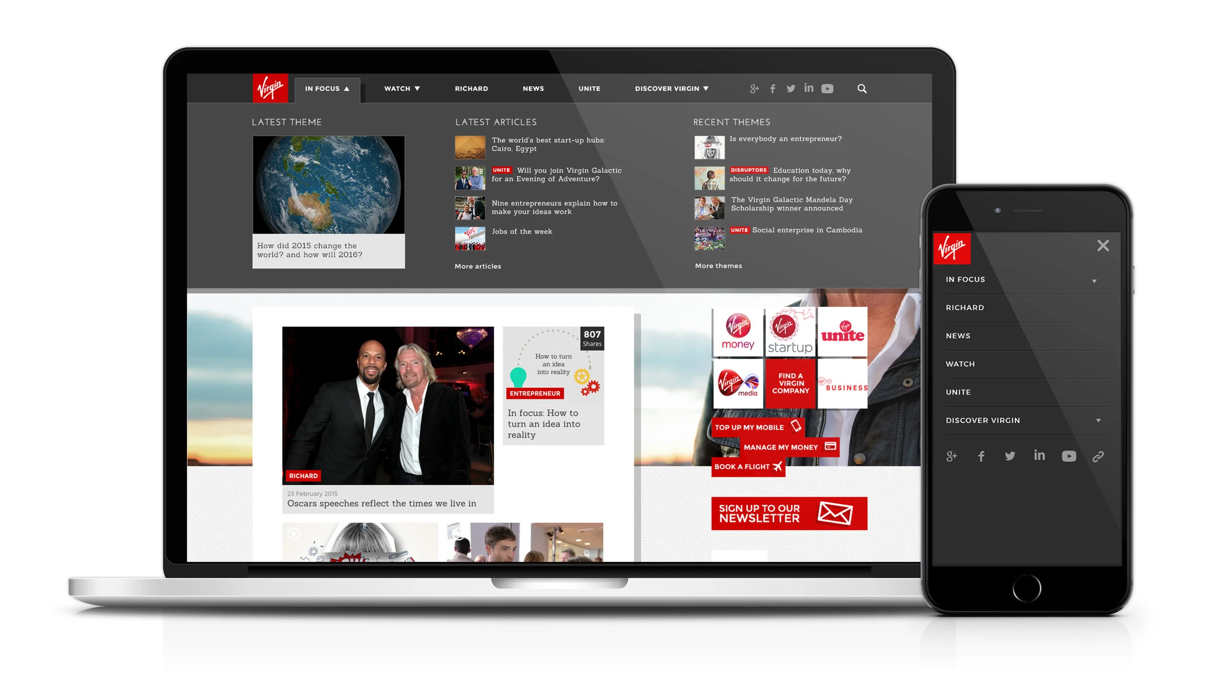
InFocus themed navigation showing latest theme, latest articles & recent themes (only available on desktop to minimise load time on mobile devices).
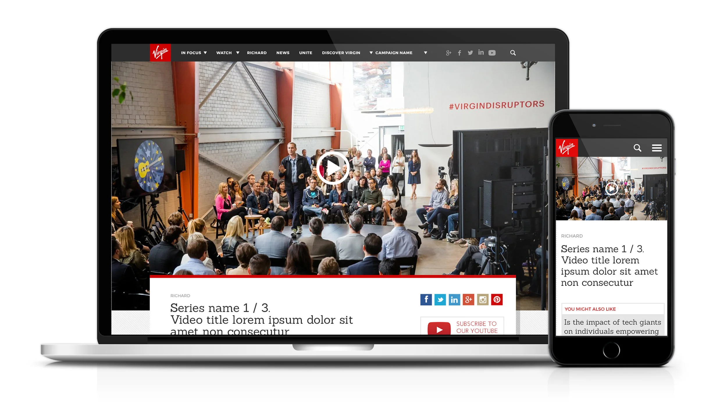
Video template will fullscreen player.

Watch menu showing the latest video content from across the site (only available on desktop to minimise load time on mobile devices).
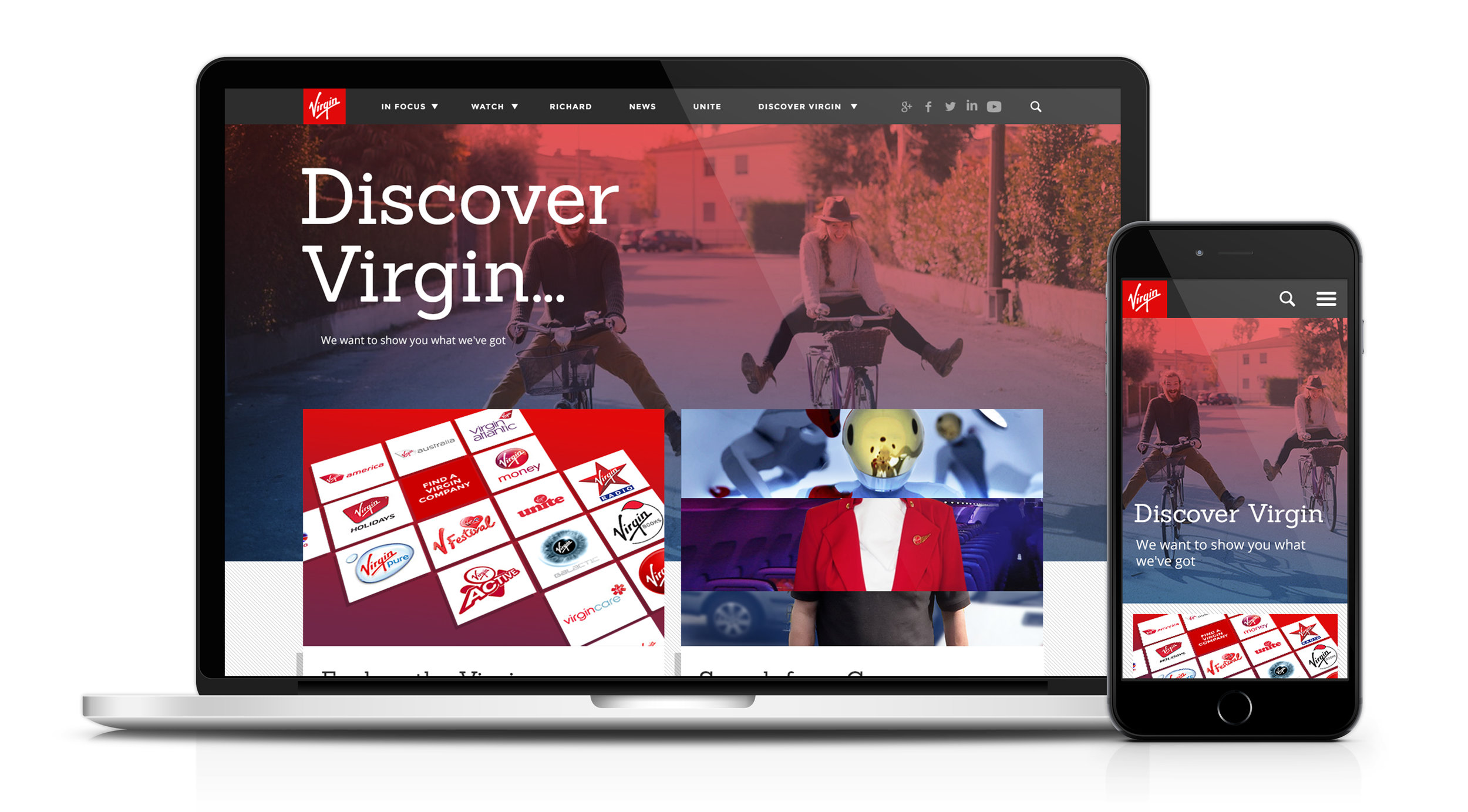
Discover Virgin landing page.
Results
2.3M
unique views per month
137%
Increase in video engagement
107%
uplift in time on site
16.85%
reduction in bounce rate
32%
increase in page views per visit